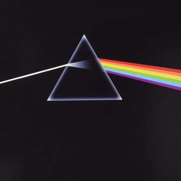
1: ‘The Dark Side Of The Moon’ (1973)
Selling over 45 million copies (and counting), The Dark Side Of The Moon turned Pink Floyd into one of the world’s biggest bands. However, while it’s widely regarded as the band’s creative peak, its stylish yet enigmatic sleeve is equally lauded.
Keyboardist Richard Wright inadvertently set the ball rolling when he suggested Hipgnosis work up something “really stylish, like a singular image, like a chocolate box”, which led Storm Thorgerson and Aubrey Powell to discover an image of a glass paperweight in a French physics book, giving them the idea of using a prism on the album cover.
“We drew it up on a piece of paper… with a bunch of other ideas,” Powell told Rolling Stone. “We just put the prism idea on the floor, and they all went, ‘That’s it. That’s the one. That’s amazing. That’s exactly what we want. That’s Pink Floyd.” So we employed a good friend of ours, George Hardie, to actually create the illustration, because we had no idea how to do that.
“It was a moment in time,” Powell continued, “and Storm, who always had absolutely the wildest ideas, realised the potential of it and went, ‘That’s it. It’s a triangle!’ So we got into triangles and the next thing, Storm and I were on a plane to Egypt, taking photos of the pyramids for the posters to go with the album. It’s very interesting, because it became one of the most iconic album covers of my generation. Of course I’m very proud of the status it gained.”
Photography: Hipgnosis | Design: Hipgnosis, George Hardie


