From hip-hop to post-rock, grunge, punk and indie, the best 90s albums captured the way that music fragmented across a head-spinningly diverse decade. And yet there remained one constant among them: the power of an arresting artwork. Here we pick the ten best 90s album covers: era-defining sleeves which continue to resonate as much as the music within.
Listen to our 90s playlist here, and check out our best 90s album covers, below.
10: DJ Shadow: ‘Endtroducing…..’ (1996)
While sampling had been intrinsic to hip-hop’s development since the birth of the genre, nobody had done it like DJ Shadow. Released in September 1996, Joshua Davis’ debut album saw the producer and DJ mine the depths of his vast record collection to create a sonic world like no other. Jazz breaks mixed with G-funk synths, B-movie samples, David Axelrod piano lines and ambient washes to point to a new future for music. Indeed, Endtroducing…..’s influence spread beyond hip-hop: Radiohead, Boards Of Canada and so many more were inspired by it. One of the best 90s album covers, the sleeve – a shot taken by noted hip-hop photographer B+ showing producer Chief Xcel and rapper Lyrics Born crate-digging in Rare Records, Sacramento – became shorthand for cool as the album’s influence spread.
Photographer: B+

9: Slint: ‘Spiderland’ (1991)
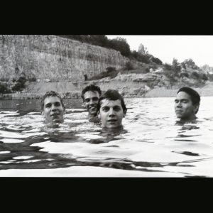
Back in the pre-streaming days, an album cover could make or break an artist’s image. In the case of Spiderland, the second album by US post-rock group Slint, the blurry black-and-white photograph of the band swimming in a quarry in Jefferson, Indiana, added to the mystery surrounding the publicity-shy four-piece. The picture was taken by Will Oldham, a friend of the group who’d go on to form the critically adored Palace Brothers and would become Bonnie “Prince” Billy. Interviewed for Breadcrumb Trail, the 2013 documentary about Slint, Oldham and band members Britt Walford (drums) and Todd Brashear (bass) reminisced about shooting the cover image, claiming that each bandmate save for guitarist Brian McMahan was arrested for trespassing.
Photographer: Will Oldham
8: Red Hot Chili Peppers: ‘Blood Sugar Sex Magik’ (1991)
Released in September 1991, Blood Sugar Sex Magik, the fifth album by Los Angeles funk-rockers Red Hot Chili Peppers, was the group’s big breakthrough. Featuring some of the best 90s songs in the shape of the hit singles Give It Away and Under The Bridge, and selling over 13 million copies worldwide, the album’s success was in part thanks to its iconic sleeve, which, as one of the best 90s album covers, cemented the group’s image in the eyes of the world. Speaking to the Los Angeles Times in 2021, bassist Flea remembered the inspiration behind the photographs of the band: “We really loved Man Ray. So we asked [film director] Gus Van Sant to take pictures and to get them solarised.” The illustration of thorns emerging from the mouth of each band member and meeting in the middle was by Dutch tattoo artist Hendrikus “Henk” Schiffmacher, who had known the Chili Peppers since their early days. Schiffmacher recalled, “I went to the States later. Tower Records was still there, this beautiful store on Sunset [Boulevard]. The store had a huge billboard of the album outside. Oh, my God, I got a boner from that thing.”
Photographer: Gus Van Sant | Illustrator: Hendrikus “Henk” Schiffmacher

7: Neutral Milk Hotel: ‘In The Aeroplane Over The Sea’ (1998)
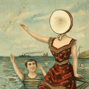
Neutral Milk Hotel’s second album created a world of dreamlike and feverish indie that seemed to exist out of time and place, with frontman Jeff Magnum’s intimate and surreal songs inspiring a cultish following which, over time, has proved incredibly influential. Artist Chris Bilheimer was tasked with creating a sleeve that reflected the esoteric delights within. Mainly known for his work with R.E.M. – he worked on all the group’s sleeves from 1994’s Monster onwards – Bilheimer would go on to produce artwork for Green Day (Nimrod, American Idiot) and Weezer (“The Green Album”). According to Kim Cooper’s 33⅓ book on In The Aeroplane Over The Sea, Magnum collected postcards featuring imagery associated with early 20th-century penny arcades, and Bilheimer cropped and aged a picture from the collection, replacing the central figure’s head with a drum in order to create a strange and unforgettable image.
Designer: Chris Bilheimer
6: Green Day: ‘Dookie’ (1994)
While their previous album, 1991’s Kerplunk, had established Green Day as a force to be reckoned with on the US punk scene, nothing could have prepared the Californian three-piece for the success of Dookie. Released in 1994, the album went on to sell over eight million copies worldwide, turning its creators into one of the biggest bands in the world. Easily one of the best 90s album covers, Dookie’s illustrated sleeve certainly helped the record gain attention. Designed and drawn by local artist Richie Butler, it showed bombs being dropped on Berkeley’s Telegraph Avenue, the centre of the East Bay punk scene. Green Day frontman Billie Joe Armstrong later told VH1’s Ultimate Albums, “I wanted the artwork to look really different. I wanted it to represent the East Bay and where we come from, because there’s a lot of artists in the East Bay scene that are just as important as the music. So we talked to Richie Bucher… He’s also been playing in bands in the East Bay for years. There’s pieces of us buried on the album cover.”
Illustrator: Richie Butler

5: Pulp: ‘Different Class’ (1995)
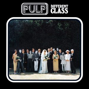
The cover of Pulp’s breakthrough album was everywhere upon its release in late 1995. Frontman Jarvis Cocker’s lyrics spoke of everyday life, and song such as Common People and Disco 2000 became alternative national anthems. Different Class’ artwork fit the music perfectly, featuring an ordinary-looking wedding photograph with a difference – life-size black-and-white cut-outs of the Pulp bandmates mingled among the guests.
Few realised that the photo was taken at a real wedding, as the groom on the day, Dom O’Connor, later told BBC Radio 6 Music: “My little brother Ben went to art college in Edinburgh and he made friends with a guy who subsequently became a photographer and had done a lot of work with the Britpop bands – I think he worked with Blur and Elastica, and, of course, Pulp. So we asked him about a couple of months before whether he would be prepared to do some photos for us… he phoned us about a week before and said Pulp were thinking about using some photos with real people in them, including a wedding photo, and if we would do some joke shots where he’d bring some life-size cut-outs of the band down, he would do some proper wedding shots for us as well.”
Photographer: Donald Milne
4: The Notorious B.I.G.: ‘Ready To Die’ (1994)
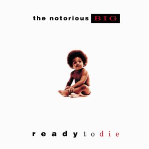
When The Notorious B.I.G. released his debut album, Ready To Die, it was received as an instant classic and went on to become hugely significant in the renewed fortunes of the US East Cost hip-hop scene. The artwork was immediately the subject of speculation, as rumours spread that the cherubic baby on the cover was Biggie himself. Years later, it was revealed that the model was a lookalike, with Bad Boy Records boss Puff Daddy admitting to Rap Radar that the label found the infant through an agency. “That was a baby we just found,” he said. “We did a little casting for somebody that looked like Big.”
In March 2011, the New York Daily Post tracked that baby down, and Keithroy Yearwood admitted to being the child in the photo. His mother, Delcenia Burns, dug up baby pictures and papers from the now-defunct child modelling agency Chicky’s Kids as proof. “We got a call from the agency saying he got the job,” she said. “We still didn’t know how big this was going to be.” Yearwood says he was paid $150 for two hours of work, but his claim to fame is invaluable.
Photographer: Butch Belair
3: Blur: ‘Parklife’ (1994)
One of the defining albums of 90s British guitar music, Parklife propelled Blur to previously unimaginable success, turning the band into household names off the back of hits such as Girls & Boys, To The End and Parklife, which provided a soundtrack to the summer of 1994.
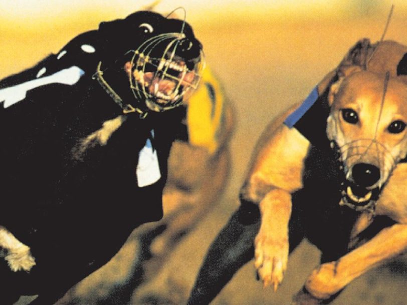
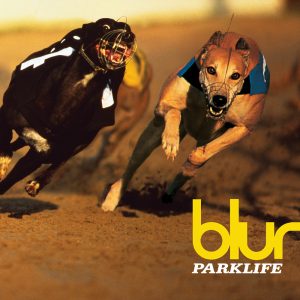
Creative agency Stylorouge had been working with Blur since the beginning. They’d made a point of using “found” imagery – taking vintage photography and placing it in a new context – on the band’s first two albums, Leisure and Modern Life Is Rubbish. After some brainstorming around images that epitomised Britishness, Blur singer Damon Albarn invited Stylorouge founder Rob O’Connor to a meeting at a betting shop in order to get a feel for how he felt Parklife should look. The agency contacted picture libraries looking for the sort of images that might be found in a betting-shop window, and eventually chose the cover shot – a photograph of greyhound racing taken in Romford, Essex, in 1988 by Bob Thomas – which was then cropped into the record sleeve. O’Connor told Amateur Photographer why he thought Parklife became one of the best 90s album covers: “The thing about this cover is it’s under-designed. It’s more about attitude than anything… I can’t knock it. The strange thing is I never met Bob Thomas and I don’t know anything more about him. But there’s no science to using a found image – it’s just about misappropriation, hoping that it works and that people understand the irony and don’t take everything too seriously.”
Photographer: Bob Thomas
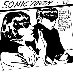
2: Sonic Youth: ‘Goo’ (1990)
Following the success of 1988’s Daydream Nation, New York alt-rockers Sonic Youth signed to major label Geffen for their sixth studio album, Goo. The album was a critical and commercial hit, helped along by a typically cool cover – an image which still adorns T-shirts and is the subject of affectionate parodies to this day.
The image was drawn by Arizona artist Raymond Pettibon, brother of Black Flag frontman and guitarist Greg Ginn. Sonic Youth’s bassist, Kim Gordon, had been a fan of Pettibon’s Indian-ink style since seeing his work in early-80s fanzines while visiting her family in LA. Pettibon based the image on a newspaper photograph of Maureen Hindley and David Smith, key witnesses in the 1966 Moors Murders trial. The twist came with its pulpy caption, which added a feeling of timeless cool to the image.
Illustrator: Raymond Pettibon
1: Nirvana: ‘Nevermind’ (1991)
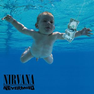
Nirvana’s second album was a phenomenon. Changing the face of music upon its September 1991 release, it has since shifted an estimated 30 million copies to date. Like Sonic Youth’s Goo, Nevermind was Nirvana’s first album for Geffen, and the group were met with opposition from the label when they presented their original vision for the cover: an image inspired by a documentary frontman Kurt Cobain had watched on water births. When that was ruled out, he hit upon the idea of picturing a swimming baby. Stock images were researched but proved too expensive for the label, so the band were forced to create their own.
After recruiting his friends’ baby, Spencer Elden, to take part, for a fee of just $200, photographer Kirk Weddle was sent to a local pool by Geffen art director Robert Fisher to shoot the cover. The image of a naked baby chasing a dollar bill might not have been especially subtle, but its sardonic take on society’s expectations perfectly fit the band’s image and the themes on the album.
Nobody expected Nevermind to be such a sensation – least of all Elden’s parents – and Spender has publicly struggled with his infamy; he will forever remain the star of what comfortably tops our list of the best 90s album covers.
Photographer: Kirk Weddle
