Enter your email below to be the first to hear about new releases, upcoming events, and more from Dig!

Please enter a valid email address
Please accept the terms
Ed Sheeran Artworks: All 18 Album And EP Covers, Ranked And Reviewed
ITAR-TASS News Agency/Alamy Stock Photo
List & Guides

Ed Sheeran Artworks: All 18 Album And EP Covers, Ranked And Reviewed

Across many albums, EPs and collaborative projects, the best Ed Sheeran artworks show the evolution of the pop superstar’s visual identity.

Back

Ed Sheeran’s meteoric rise from flame-haired independent artist to Britain’s hottest pop sensation has seen him develop a vibrantly colourful aesthetic across all his album and EP artworks to date, perfectly matching his eclectic songwriting abilities. With his father, John, being an art curator, and his mother, Imogen, a much-lauded jewellery designer, Sheeran is a keen painter himself, and his artistic sensibilities have always blessed him with a clear idea of how to present his music in highly marketable ways.

Here are all of Ed Sheeran’s artworks ranked and reviewed, revealing why the singer-songwriter’s album and EP covers have gathered such enormous appeal across the world.

Ed Sheeran’s Album Covers, Ranked And Reviewed

7: ‘Spinning Man’ (2004)

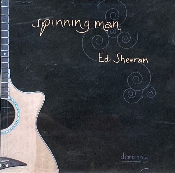
We start with a rarity. In 2004, a 13-year-old Ed Sheeran recorded his first collection of songs, Spinning Man, designing the cover himself and burning a limited number of copies on his home computer. Its opening track was an early version of a pop-punk rocker called Typical Average. “There are probably 20 copies of Spinning Man in existence, and I have 19 of them,” Ed wrote in his photo memoir, Ed Sheeran: A Visual Journey. “I don’t want anyone else to get hold of a copy.”
Ed Sheeran Spinning Man

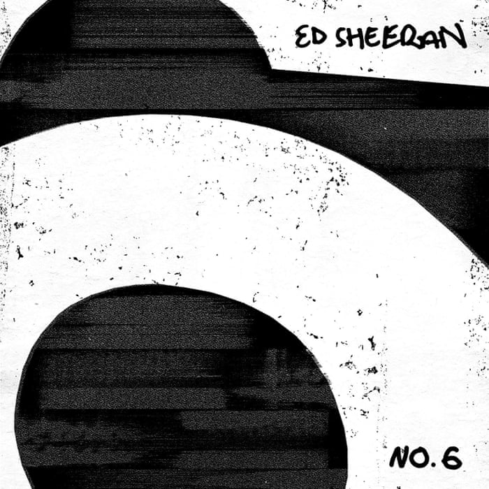
6: ‘No.6 Collaborations Project’ (2019)

Ed Sheeran’s fourth album, No.6 Collaborations Project, saw him work with well-known US hip-hop and R&B artists such as Travis Scott and Khalid. The artwork was designed by Adult Art Club, with creative director Jonny Costello admitting it “was a bit of a team effort with the team at Warner”. Continuing the graffiti-inspired aesthetic of ÷, the artwork started life as a proposed series of stencil-like drawings of Ed, before evolving into a street-smart snatch of minimalist black-and-white typography.

No.6 Collaborations Project

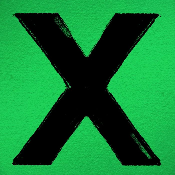
5: ‘×’ (2014)

Originally used as a holding cover on iTunes, Ed Sheeran abandoned plans to commission a new cover for his second album, ×, after growing attached to it. “It was only meant to go up until the real artwork was finished,” Sheeran later revealed. “I just really liked it. It was just simple, effective, stood out. People know what it is.” Exhibiting a stark green background with a black cross painted on, DIY-style, it was another example of how Ed Sheeran’s artworks revealed the singer’s penchant for mathematical symbols.

Multiply Ed Sheeran

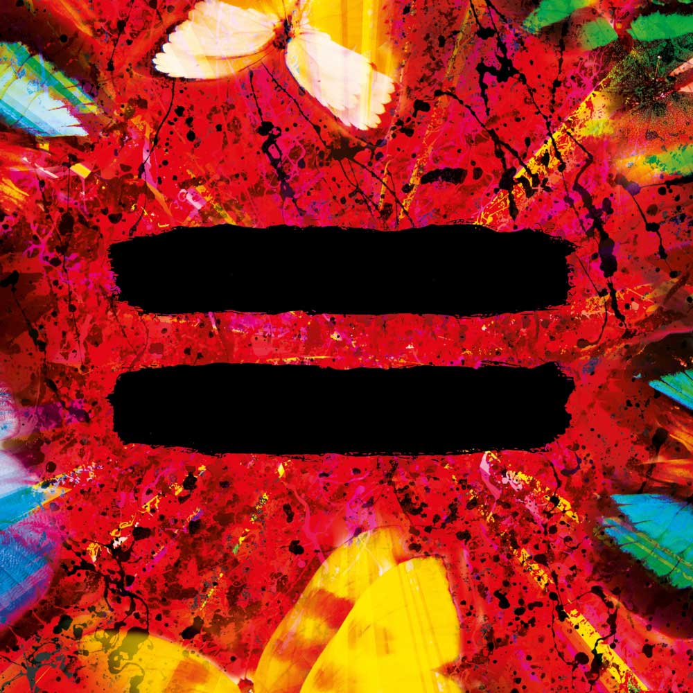
4: ‘=’ (2021)

For Ed Sheeran’s fifth album, =, released in 2021, the cover design built upon the abstract style of spin art he used on ÷, this time with a vibrant red background embellished with multi-coloured butterflies. Created by Sheeran himself, the artwork follows a series of Jackson Pollock-inspired paintings he has made and auctioned off in recent years, with one recently raising £51,000 for a cancer charity. The presence of butterflies also suggests the influence of Sheeran’s artist friend Damien Hirst, who is famous for including butterflies in his work to express his fascination with mortality. “I love butterflies because when they are dead they look alive,” Hirst once said.

Best Ed Sheeran album covers Equals

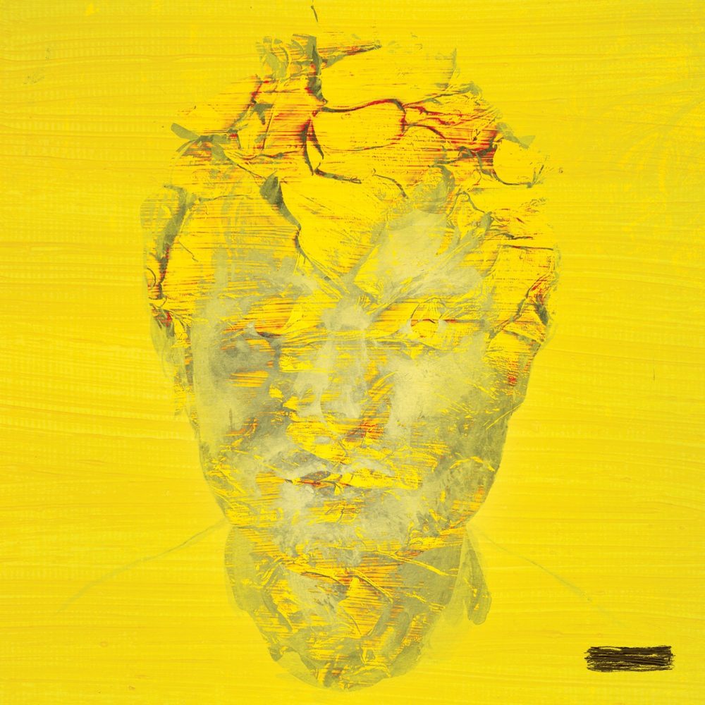
3: ‘-’ (2023)

In contrast to his previous mathematic-symbol album covers, the artwork for Ed Sheeran’s sixth album, -, showcases a striking change in direction. Set against a backdrop of mustard yellow is a sombre grey illustration of Sheeran’s face, corroding into a heart shape. This poignant image symbolises the deep emotional turmoil Sheeran experienced while grappling with the loss of his dear friend Jamal Edwards. “I was spiralling through fear, depression and anxiety,” the singer-songwriter told The Guardian. “For the first time I’m not trying to craft an album people will like, I’m merely putting something out that’s honest and true to where I am in my adult life.” The record’s emotional honesty is reflected in what’s certainly one of the best Ed Sheeran album covers to date.

Ed Sheeran Subtract

2: ‘+’ (2011)

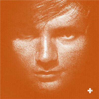
Gracing Ed Sheeran’s debut album for a major label, the + artwork bathed his sullen visage in a glorious orange hue. Originally drawn in black pastel on coloured paper, Phillip Butah’s portrait sketch was re-worked into its famous neon-orange background. “It shows Ed emerging from the gigging circuit and into the public eye,” Butah said. “I wanted it to become iconic.” With + standing as one of the biggest debut albums of the 2010s, its cover’s iconic status is guaranteed.

Plus Ed Sheeran

1: ‘÷’ (2017)

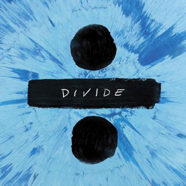
Tasked with designing a cyan-blue cover for Ed Sheeran’s third album, ÷, UK designers Adult Art Club worked closely with the talented singer-songwriter. “Ed made the spin painting himself,” creative director Jonny Costello said. “He’s friends with the artist Damian Hirst, and Hirst allowed him to use one of his spin-painting machines at his studio.” The radiating spin effect coupled with the black divide symbol was instantly iconic, and easily tops our list of the best Ed Sheeran album covers.

Divide Ed Sheeran

Ed Sheeran’s EP Covers, Ranked And Reviewed

9: ‘Thank You’ (2011)

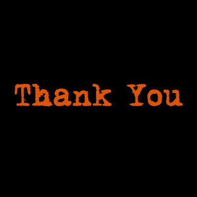
The Thank You EP, with its plain black cover and orange text in Sheeran’s famous Mom’s Typewriter font, was released on Atlantic in September 2011, the same month as his official debut album, +. Containing just three tracks in the shape of lo-fi acoustic versions of Fire Alarms and She – as well as a True Tiger remix of You Need Me, featuring Scrufizzer and Dot Rotten – it nicely complements the + aesthetic, but is noticeably sparser in sound.

Thank You


8: ‘The Orange Room EP’ (2005)

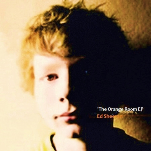
One of Ed Sheeran’s earliest self-released efforts, The Orange Room features a low-res photograph of the 13-year-old Ed Sheeran flush from recording a series of Oasis-inspired songs in his bedroom. Containing four of the songs from Spinning Man – including a re-recorded version of Typical Average – he used his birthday money to manufacture 1,000 copies. “My mum’s still got a stack of them, but I’ve banned her from selling them,” Sheeran admits. “Again, I don’t want people to have them.”

The Orange Room EP

7: ‘Ed Sheeran’ (2006)

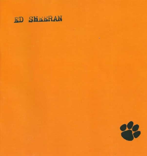
Since Sheeran’s parents did a lot of community outreach in schools with young creatives, a graffiti artist named Graham Dews (aka Paris) met Ed Sheeran when the singer was 14. After Sheeran asked him to create the artwork for this homemade EP, Graham found a clip-art paw print and laid it on a bright-orange background, immediately establishing a visual motif that would reappear across several Ed Sheeran artworks. Years later, Sheeran would discover that Dews had gone on to spray designs onto the guitars used by Coldplay on their Mylo Xyloto tour.

Ed Sheeran


6: ‘One Take EP’ (2011)

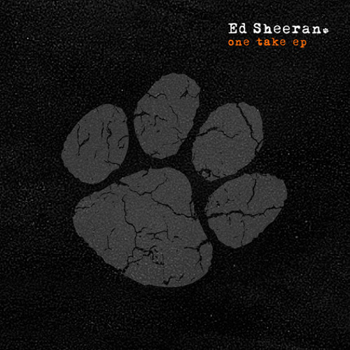
Still utilising the Mom’s Typewriter font, Ed Sheeran continued with a minimalist feel on the One Take EP. His first release on a major label was headed up by a cover of the 19th-century US Civil War-era folk song Wayfaring Stranger. Again, the paw print makes an appearance. “People ask me what the significance in the paw print is,” Sheeran tweeted in May 2011. “I don’t have an answer, so I tell them it’s tiger blood. They don’t get it.”

One Take EP

5: ‘Live At The Bedford’ (2010)

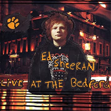
Performed with a band at a pub in Balham, London, the Live At The Bedford EP features live renditions of many songs that would later be included on +. Then an independent artist, Sheeran was still earning the bulk of his income from selling CDs himself while testing out his material with other gigging musicians. The rudimentary cover features a 19-year-old Ed Sheeran with his orange paw-print logo photoshopped against an image of the venue famous for championing unsigned acts.

Live At The Bedford

4: ‘Want Some?’ (2007)

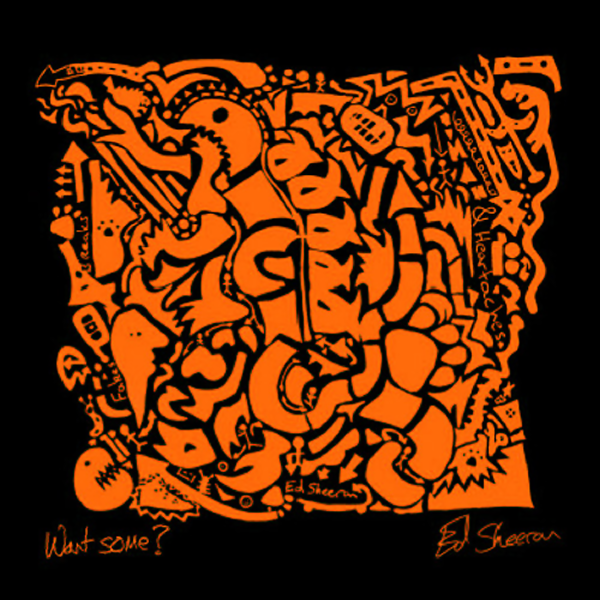
Street-art inspirations and a fondness for the colour orange make themselves felt on many early Ed Sheeran artworks, and Want Some? was another of the singer-songwriter’s self-released EPs with a cover featuring abstract illustrations. Fun and cartoony, the striking cover seemed to impress many punters Ed came across at open-mic nights while gigging his way around London and road-testing his folk-inspired tunes. “I’d sell ten to 20 CDs a night for a tenner,” Sheeran would later recall. “For a kid with a rucksack, I did alright.”

Want Some?


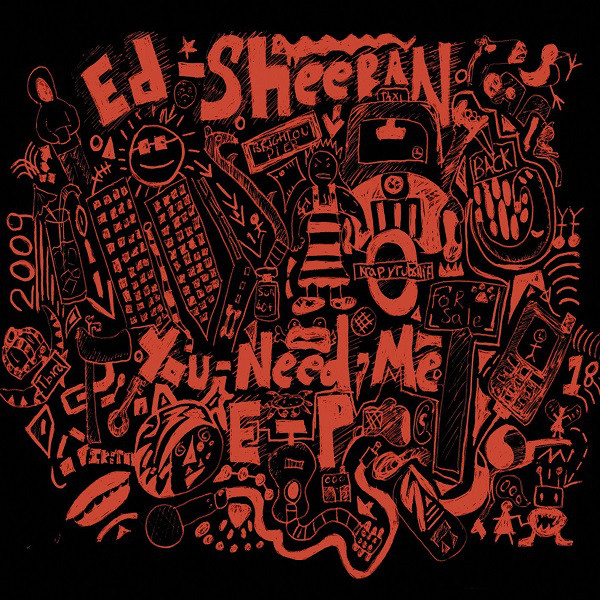
5: ‘You Need Me EP’ (2009)

Planting the seeds of Sheeran’s unique combination of folk and hip-hop, the You Need Me EP showcased a new musical approach that would turn him into a household name. Featuring a slew of graffiti-esque doodles, the illustrated cover is an innocent expression of life as an unsigned artist in London. Recorded with producer Jake Gosling, the EP features an early version of the acoustic rap song that would attract the attention of major labels, and which is still hailed as one of the best Ed Sheeran songs of all time, You Need Me, I Don’t Need You.

You Need Me EP


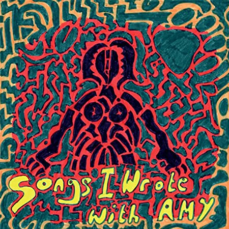
4: ‘Songs I Wrote With Amy’ (with Amy Wadge) (2010)

The Songs I Wrote With Amy EP contains a handful of songs written in the Welsh village of Trefforest with songwriter Amy Wadge. “I was heavily pregnant with my second child so couldn’t travel,” Wadge remembered. Its colourful, psychedelic features an illustration of a woman surrounded by a mosaic-like collage of greens and reds. Whether this is a Picasso-esque depiction of Amy is anyone’s guess, but the EP itself saw Ed maturing as a songwriter.

Songs I Wrote With Amy

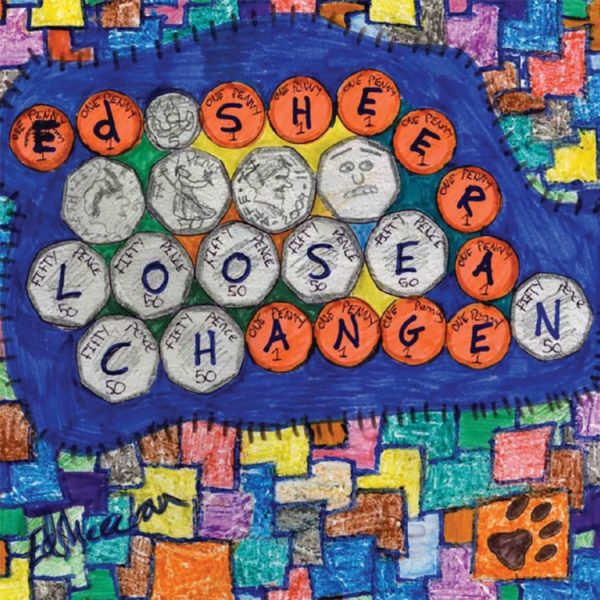
3: ‘Loose Change’ (2010)

“I wanted to do something completely different production-wise to the last EP,” Ed Sheeran said of Loose Change. Recorded with producer Jake Gosling at Sticky Studios, in Surrey, and released in July 2010, the cover depicts a series of 50p coins against a mish-mash of blocks drawn in multi-coloured crayon. “Songwriting-wise I was trying to write something different, without being love songs,” Sheeran explained, gifting listeners a colourful foray of tunes self-funded from the sales of his previous EP, You Need Me.

Loose Change

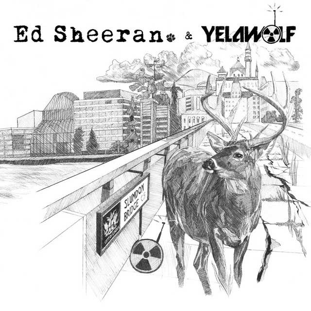
2: ‘The Slumdon Bridge’ (with Yelawolf) (2012)

Ed Sheeran’s longstanding friend Phillip Butah designed the artwork for The Slumdon Bridge EP, the singer’s collaboration with US rapper Yelawolf. As the youngest prize-winner of Young Artists’ Britain, in 1998, Butah drew a photorealistic pencil sketch of London Bridge – rechristened “Slumdon Bridge” – featuring a stag next to a radioactive dog tag. The result was one of the finest Ed Sheeran artworks.


1: ‘No.5 Collaborations Project’ (2011)

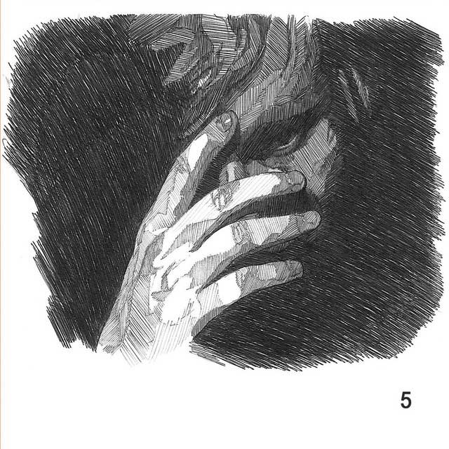
The grime/indie mashup EP No.5 Collaborations Project featured many UK rappers, among them Devlin, Wiley, JME and Ghetts, who worked with Ed Sheeran to demonstrate the acoustic songwriter’s crossover appeal with London’s hip-hop scene. The artwork was drawn in Jake Gosling’s studio, with artist Phillip Butah using a biro to portray Sheeran in shadow, concealing his face with his hand. “Ed was nervous about being on the cover,” Butah said, “so I created the work as him slowly revealing himself.”

No.5 Collaborations Project

Buy Ed Sheeran vinyl at the Dig! store.

Original article: 11 August 2021

Updated: 30 May 2022

More Like This

Best Christmas Adverts: 10 Classic Seasonal Commercials
List & Guides

Best Christmas Adverts: 10 Classic Seasonal Commercials

Wrapping sales pitches in festive cheer, the best Christmas adverts have come to induce nostalgia in many during the holiday season.

Best Songs Of 2024: 40 Great Tracks That Define The Year
List & Guides

Best Songs Of 2024: 40 Great Tracks That Define The Year

From nu-disco chart-toppers to sharp-tongued diss tracks, the best songs of 2024 proves that musical creativity is in rude health.

Sign up to our newsletter

Be the first to hear about new releases, upcoming events, and more from Dig!

Sign Up